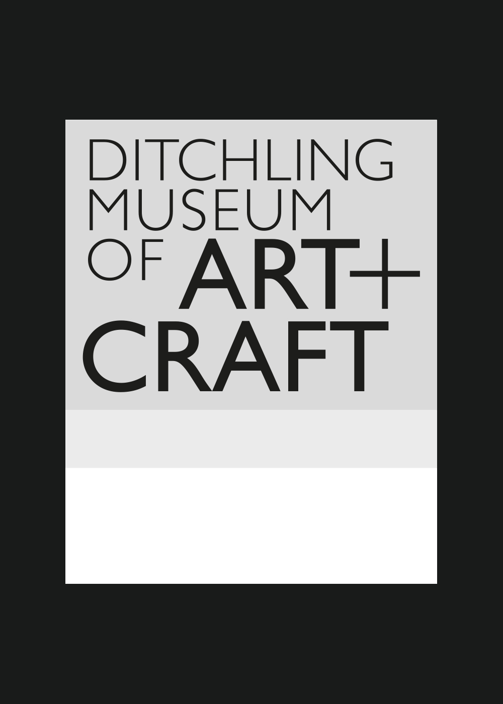
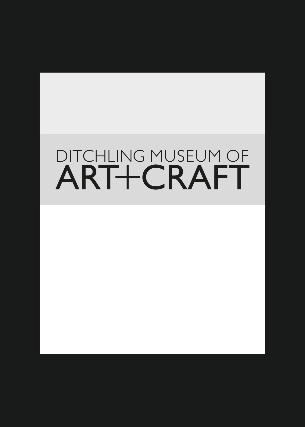
Ditchling Museum of Art + Craft
Honouring heritage. Enabling possibility
To celebrate its 40th anniversary and respond to a shifting cultural landscape, Ditchling Museum of Art + Craft partnered with us to refresh their visual identity. The goal was to honour the museum’s rich heritage while opening the doors to a broader, more diverse audience.
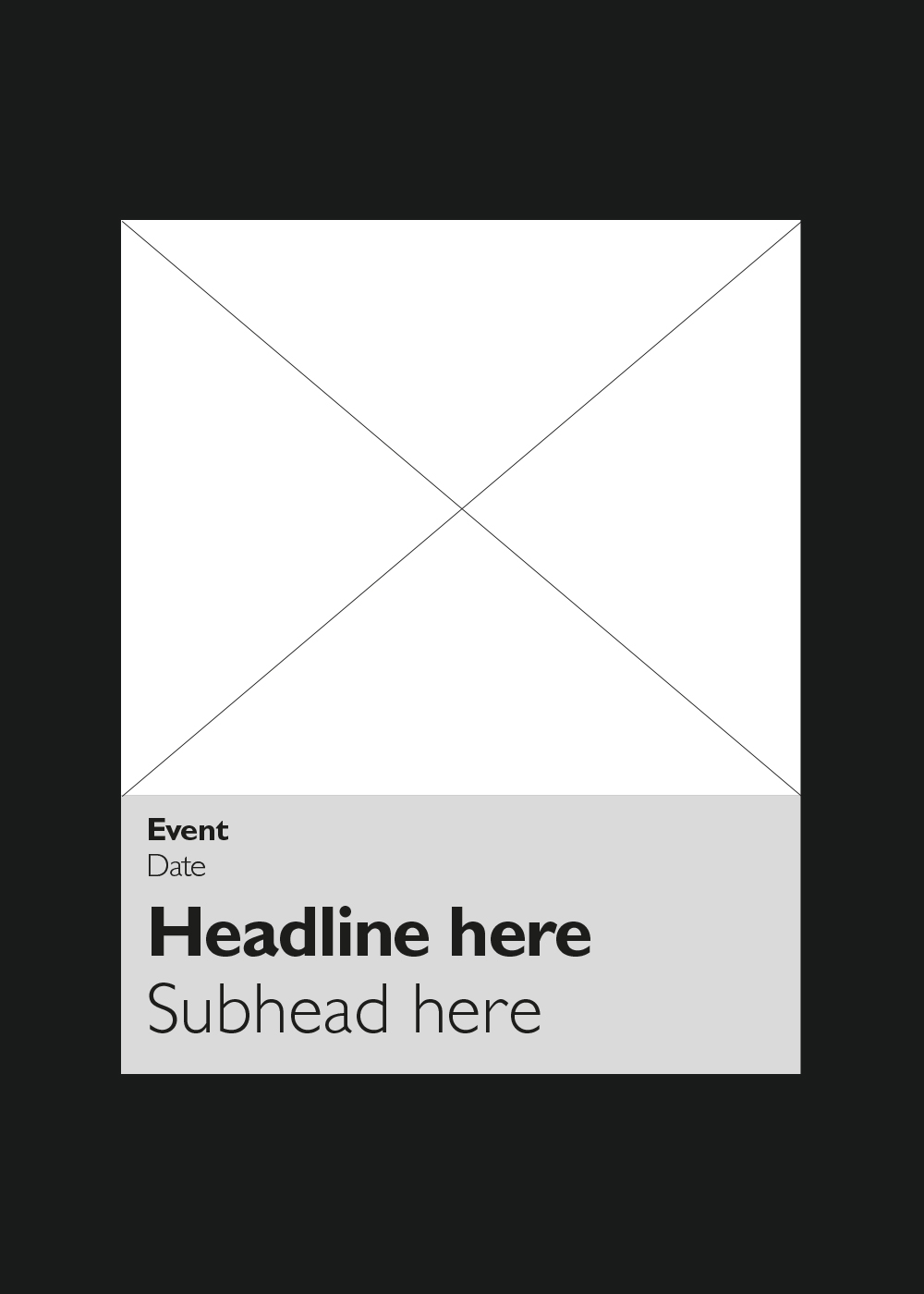
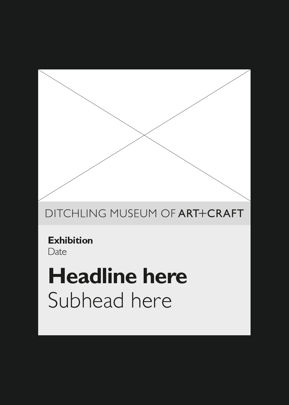
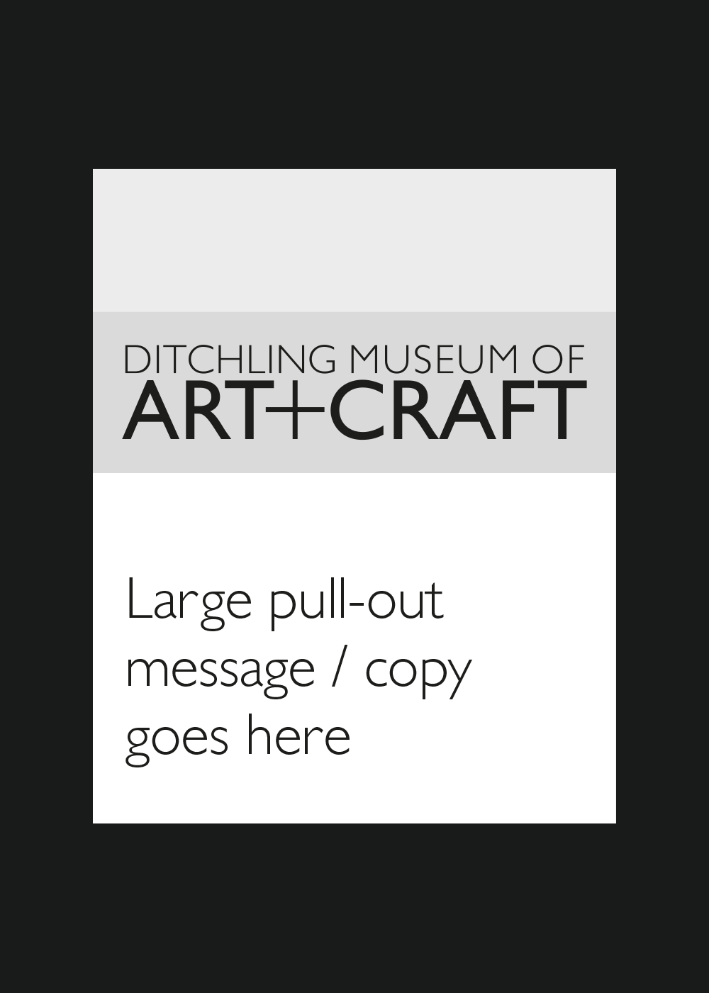
A key challenge was usability. With a small team and limited resources, they needed a visual system that was not only beautiful but also highly practical. In response, we created a comprehensive brand toolkit that empowers the museum team to produce high-quality content independently, confidently and consistently.
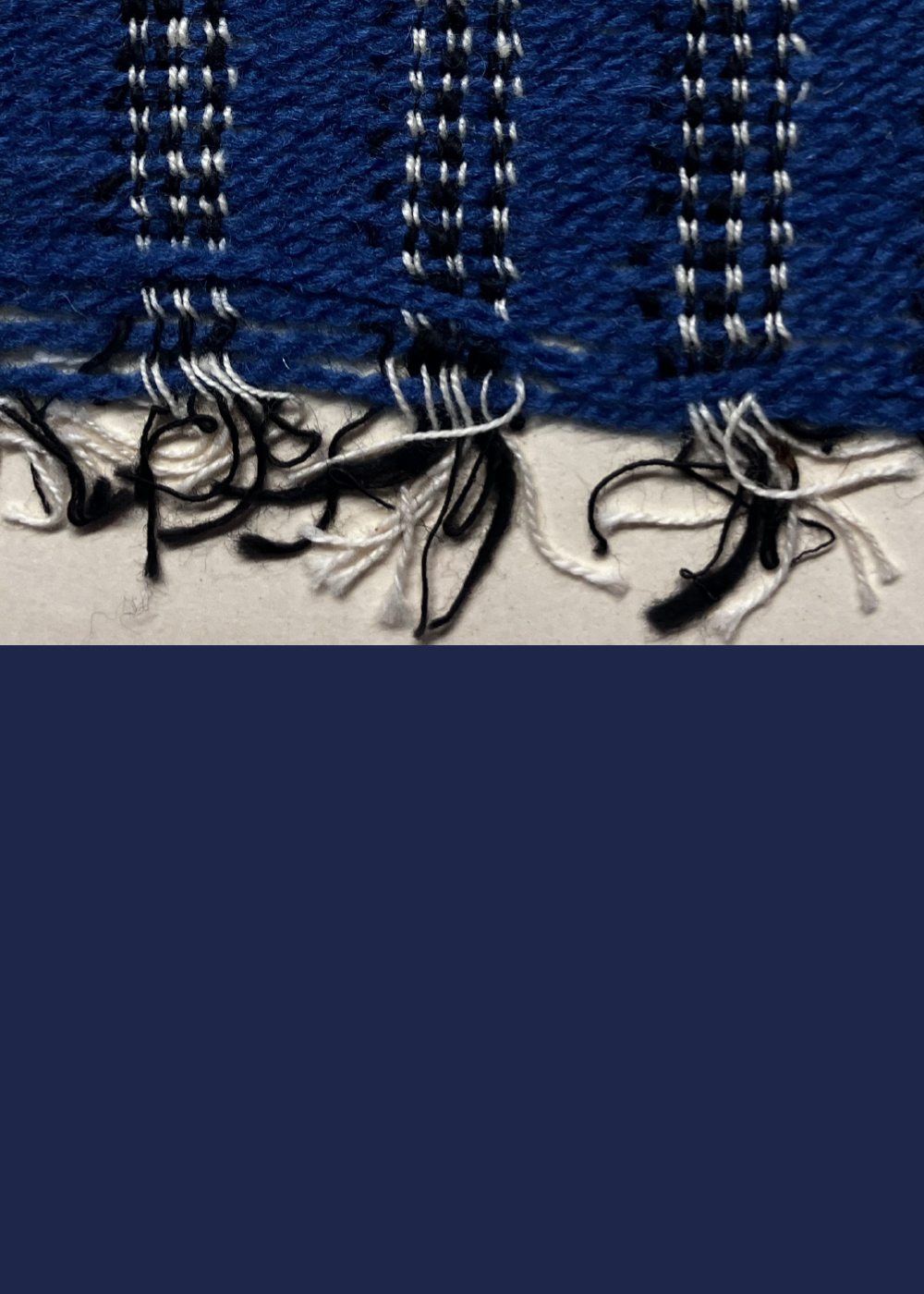
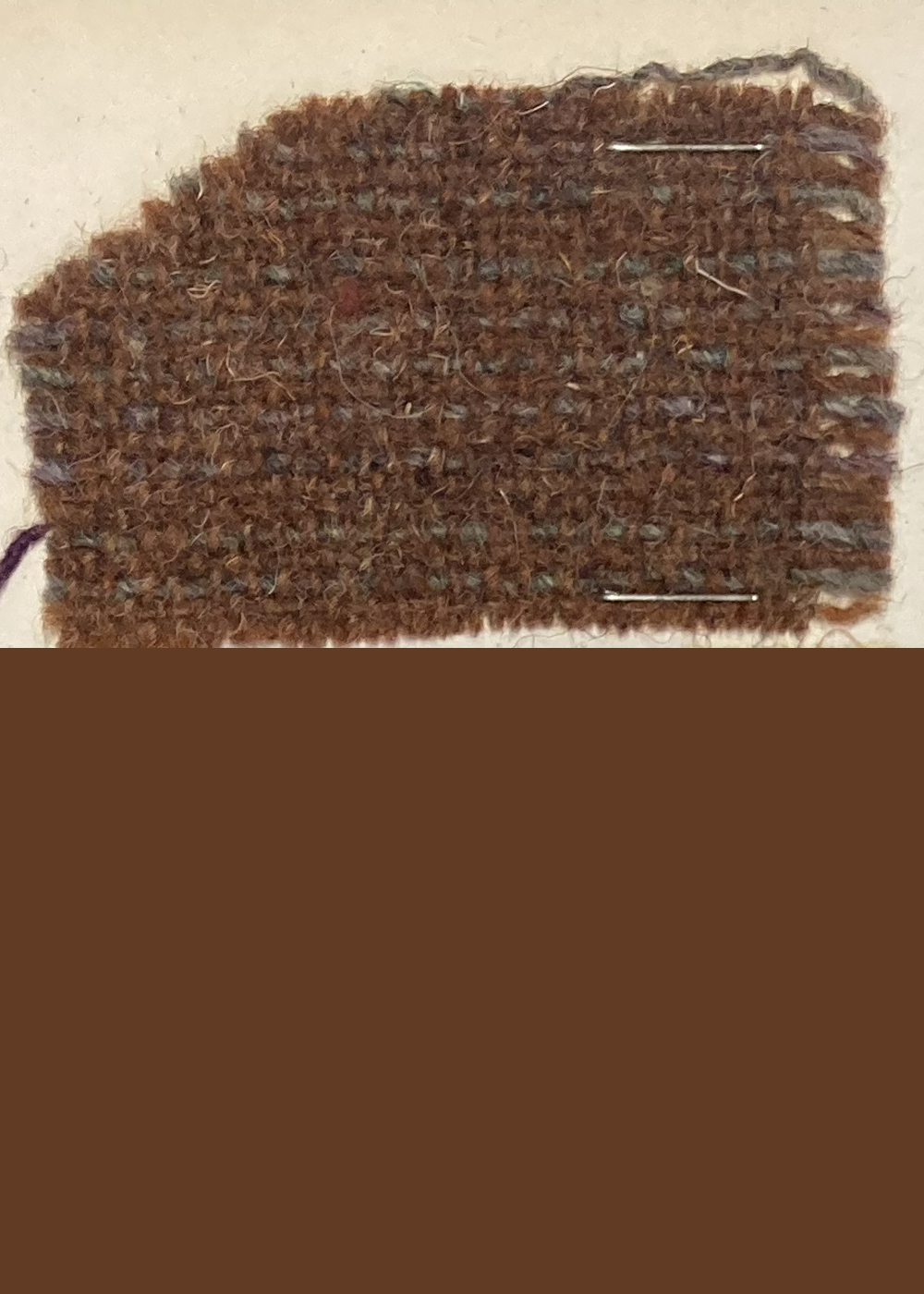
The refreshed identity draws on the museum’s remarkable archive of over 20,000 craft and design objects. Rather than a complete overhaul, the update is a thoughtful evolution that maintains the structural integrity of the original identity, designed by renowned typographer Phil Baines, while introducing new elements to increase flexibility, clarity, and warmth.
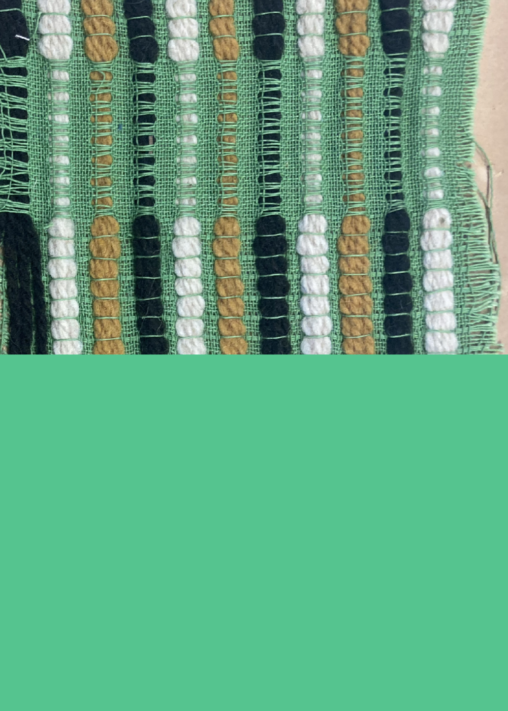
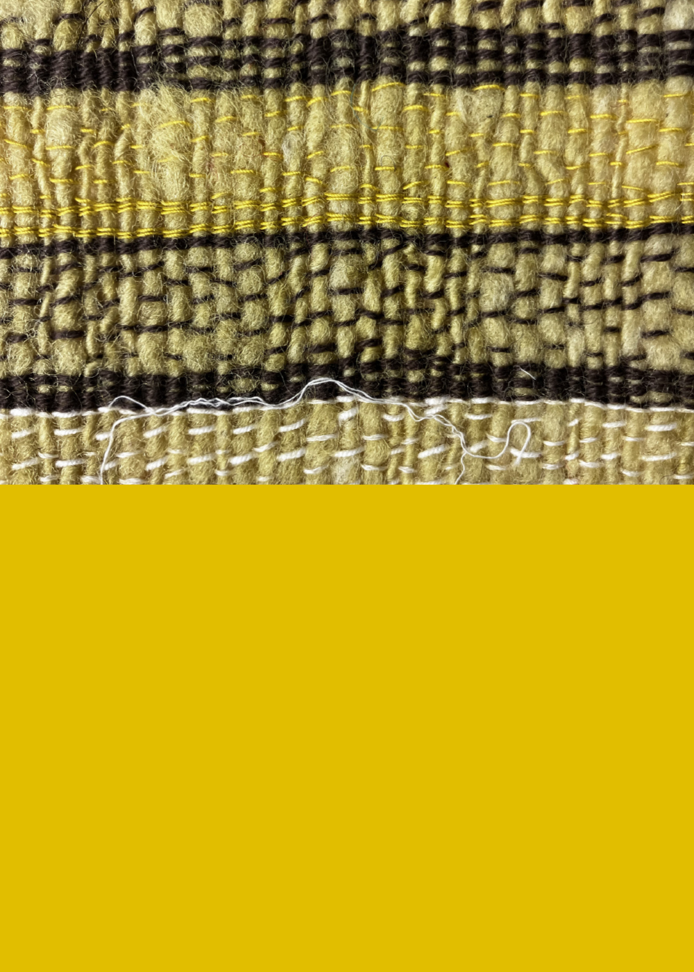
The colour palette expands beyond the museum’s signature black and red, embracing a range of rich, warm tones that reflect the diversity and depth of its collection. The new system also includes adaptable layouts and user-friendly digital tools, all designed with the realities of a small, creative team in mind.
This updated identity reflects their mission: to celebrate the legacy of art and craft while engaging a new generation with clarity, creativity, and confidence.


“They approached the existing identity with real care and intelligence, honouring its strengths while evolving it into something that feels both contemporary and true to who we are.”
Abby Butcher
Audience Development and Communications Manager