Fabrica
Making art for everyone
Based in Brighton’s historic lanes, Fabrica is a space where everyone can experience contemporary art. Through high profile exhibitions, visitors are introduced to the work of celebrated artists. At the same time, they commission less-established artists, giving them the financial and creative support to produce thrilling new work. This way, great art is always there to surprise, challenge and inspire the local community.
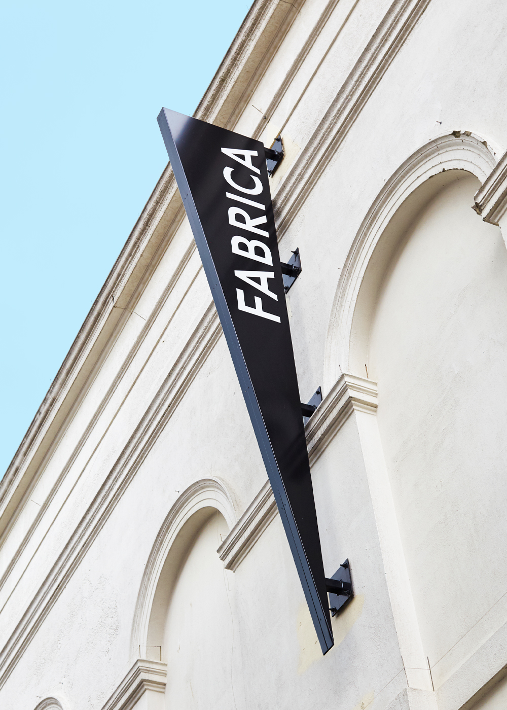
However. Visibility has long been a challenge for Fabrica. People can be intimidated by contemporary art, so helping them engage with it isn’t easy in the first place – but Fabrica’s outdated brand didn’t help, as it was no longer fit for current digital channels. At the same time, Fabrica’s space caused confusion – the beautiful grade II listed building had previously been a church, and many passers-by thought it still was. Fabrica needed a brand that would make them, and their art, more engaging and welcoming. Not just changing the way the community see Fabrica, but how they see contemporary art.
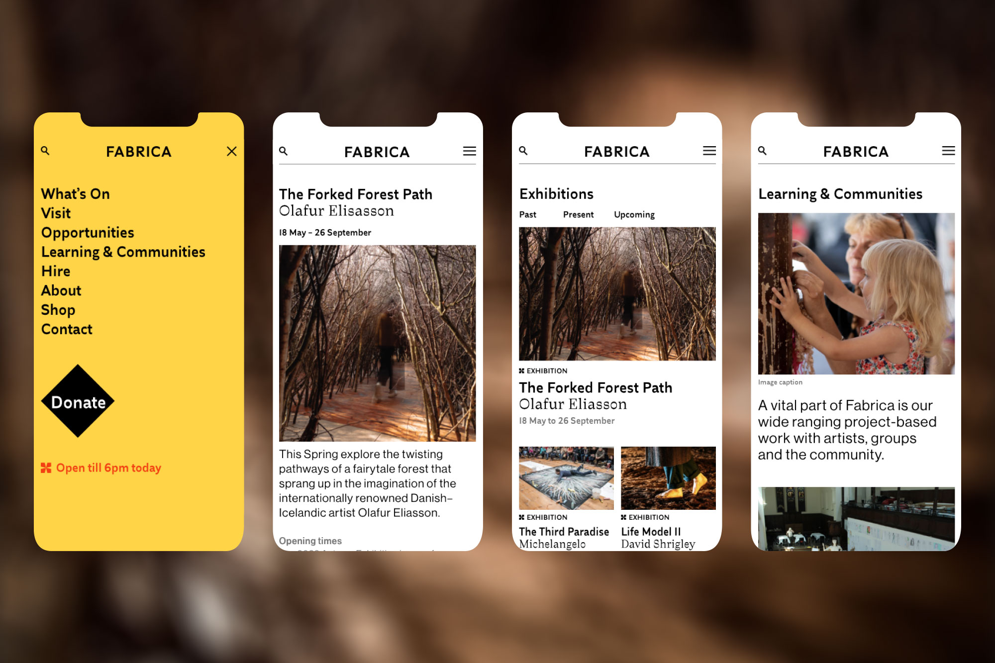
Fabrica commissioned us to create a new brand that could help raise the gallery’s profile, and change perceptions about contemporary art too. We needed to communicate their belief that contemporary art is for everyone.
PROJECT SCOPE
Brand identity
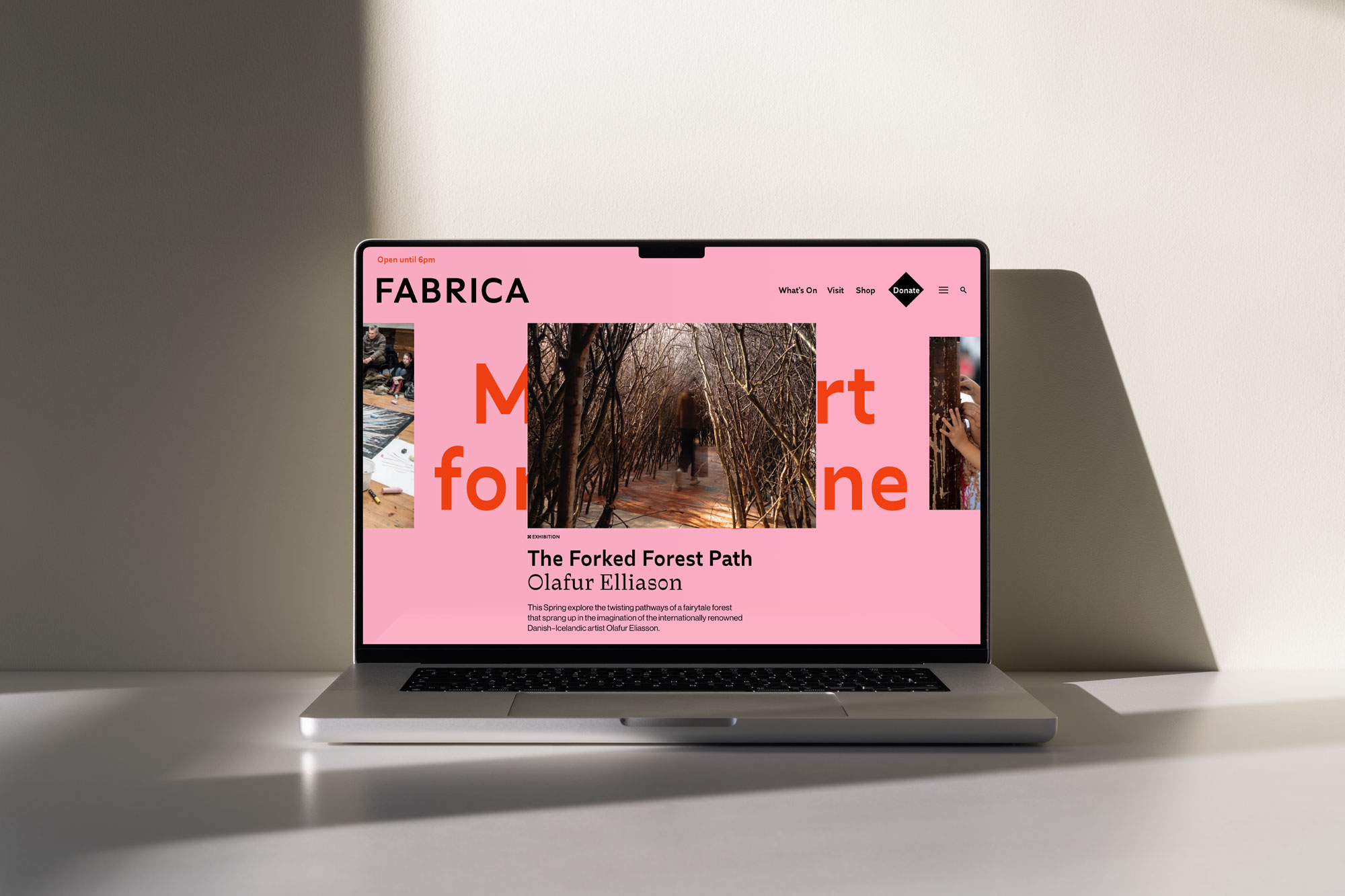
Website design
Brand communications
Art direction
Animation
Social Content

“People sometimes see art galleries as cold, white cubes that feel quite exclusive. We’re the opposite of that – through our exhibitions and community projects, we want to show that everyone can experience and enjoy contemporary art. That’s why it was so important for us to have a brand that would communicate our work clearly and consistently, and say to our community: this is for you. That’s exactly what Boyle&Perks have achieved.”
Liz Whitehead
Director of Fabrica
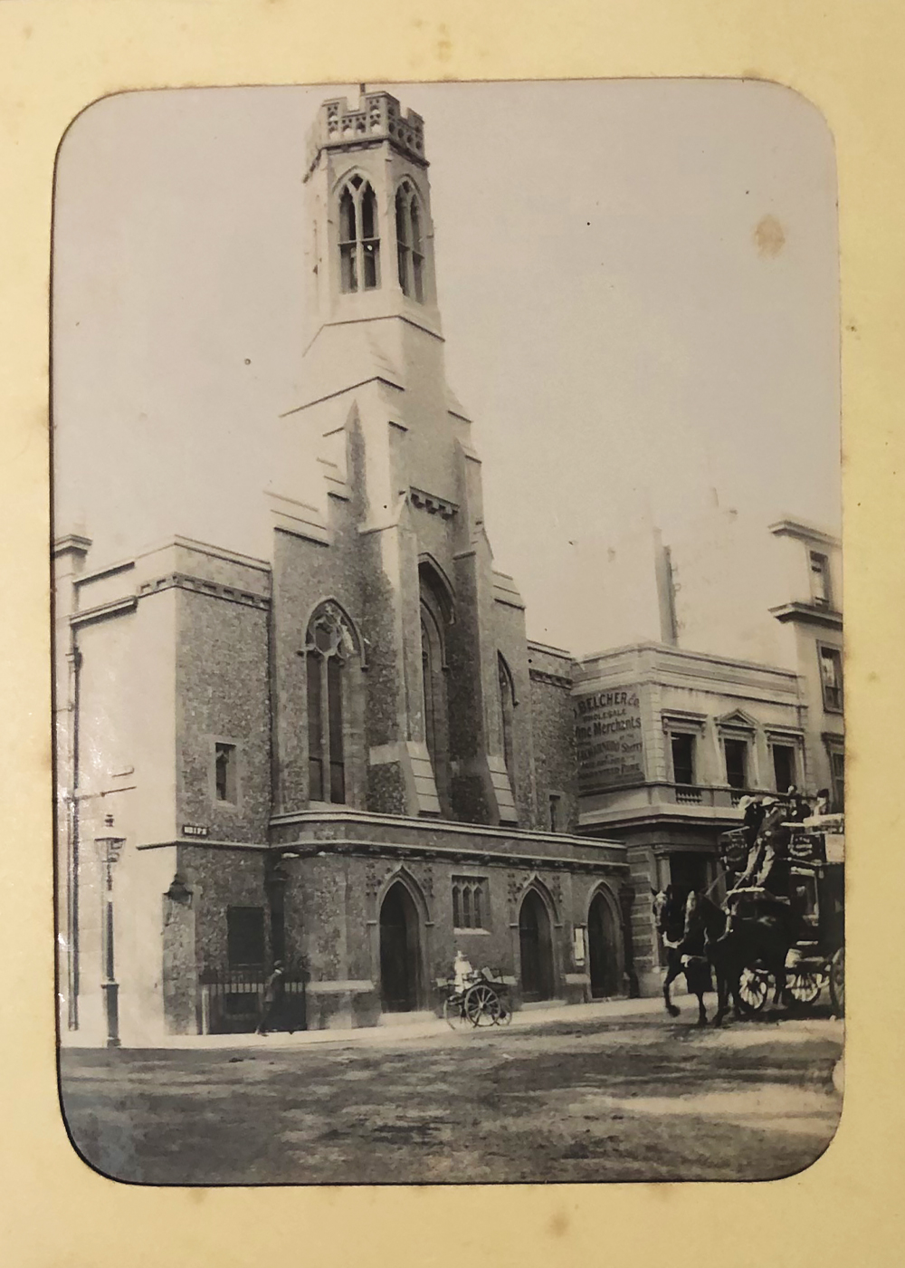

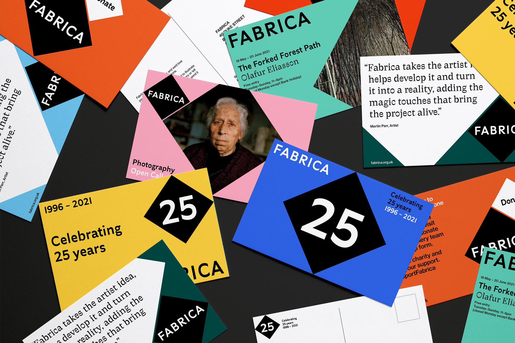
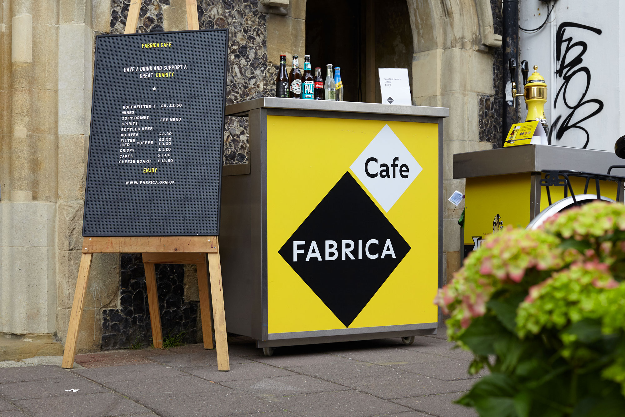
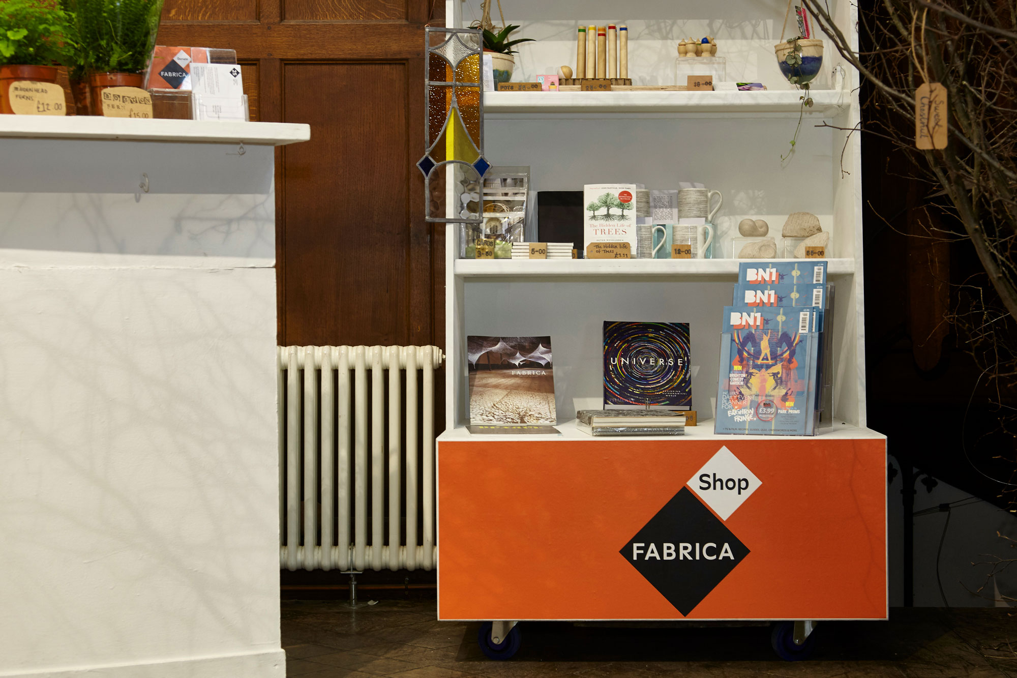
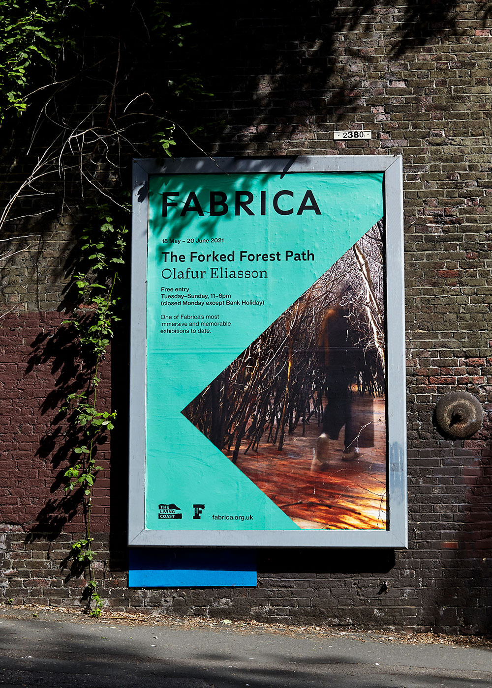
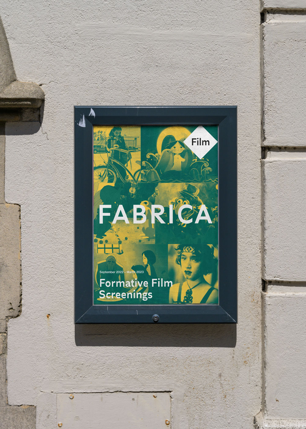
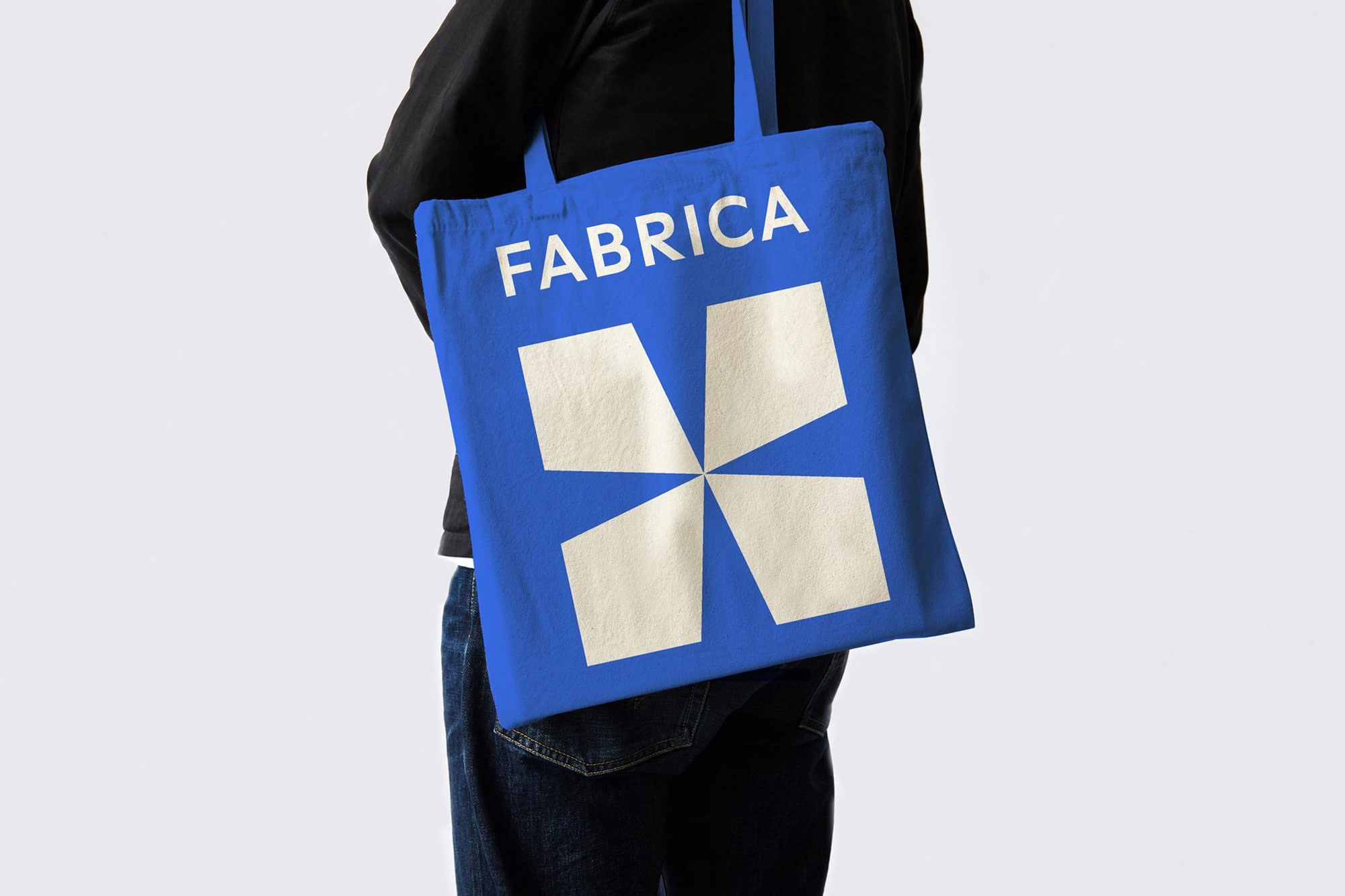
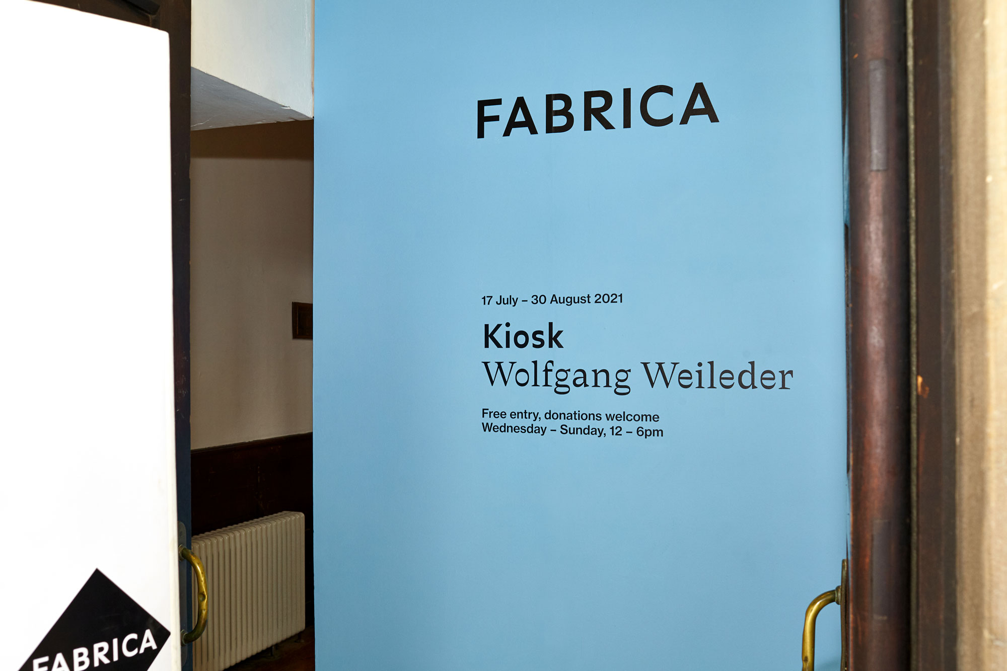
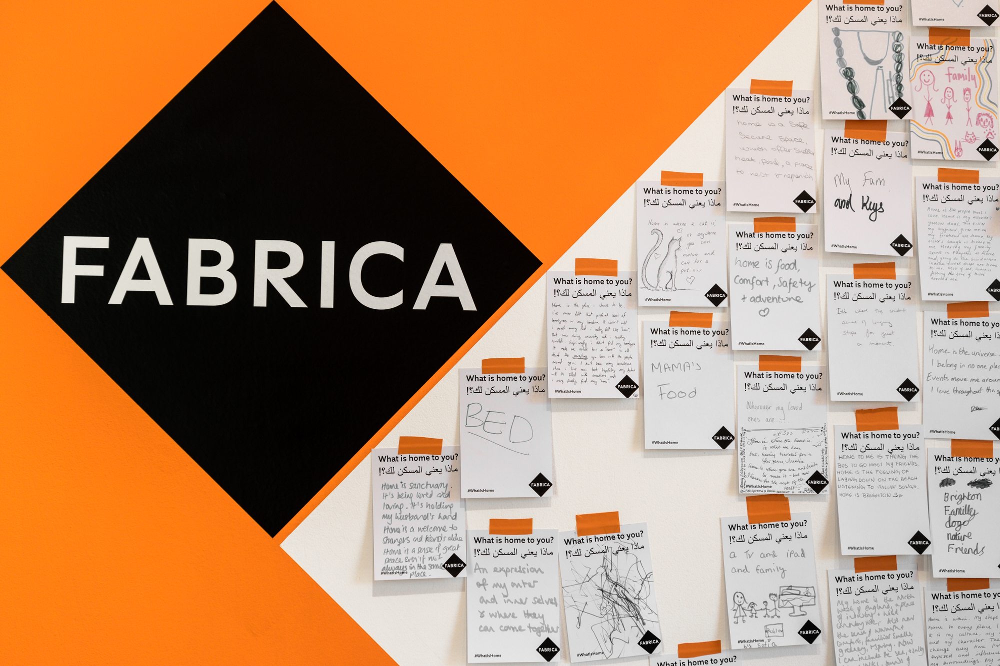
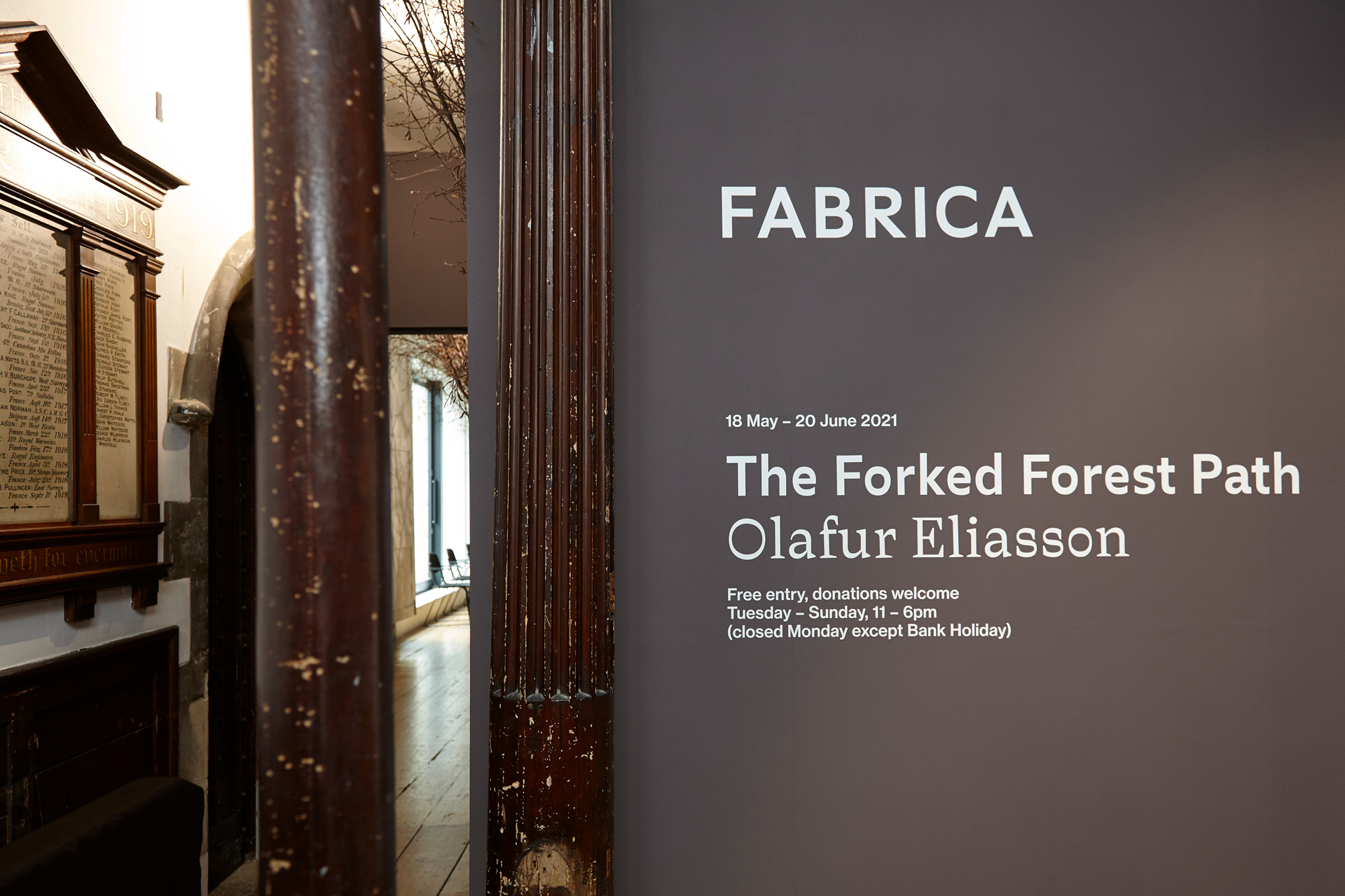
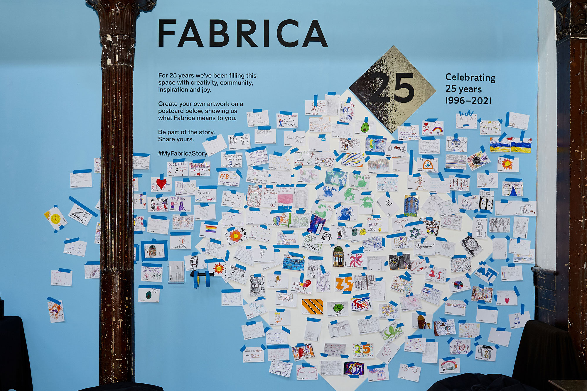
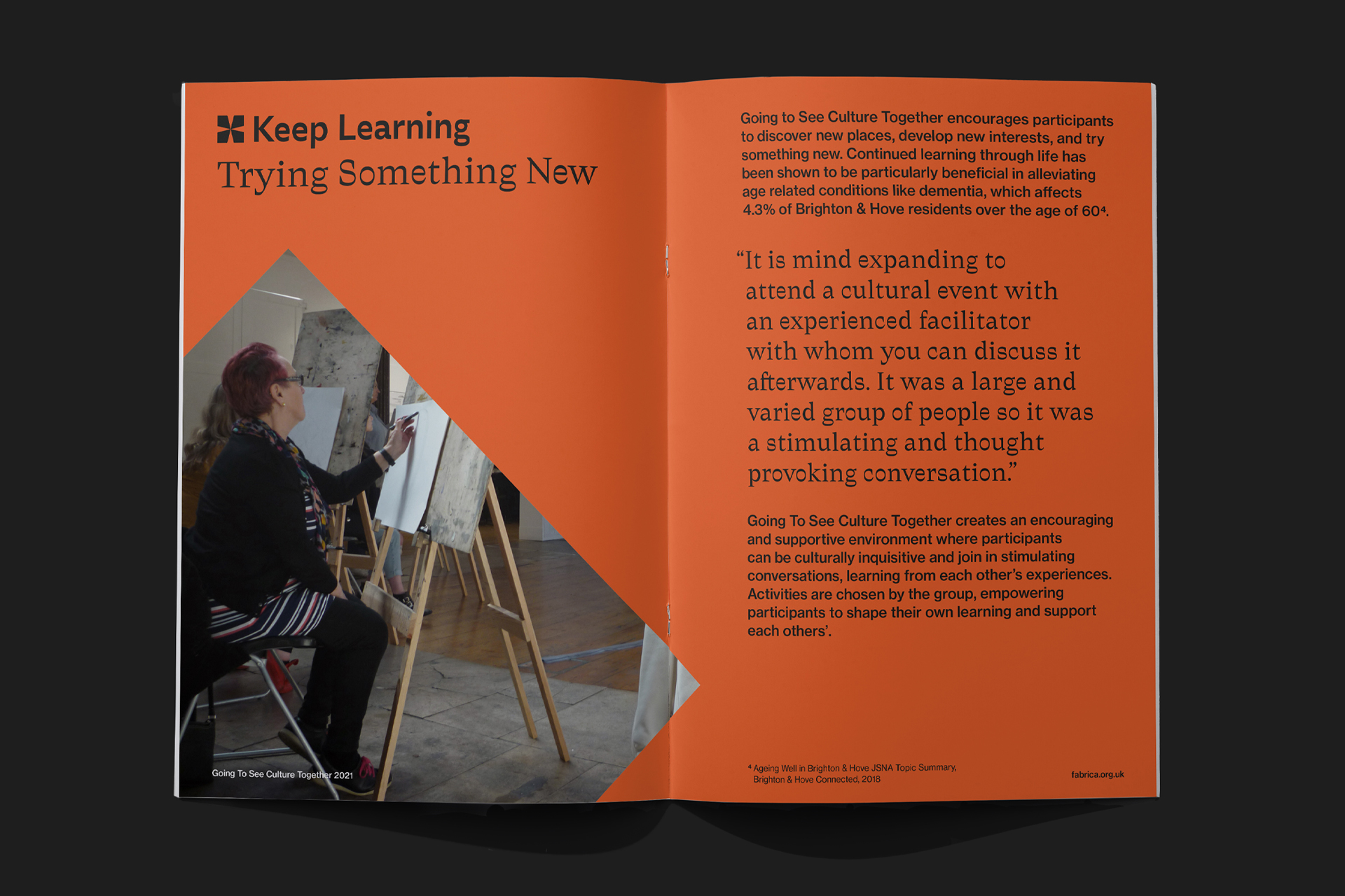
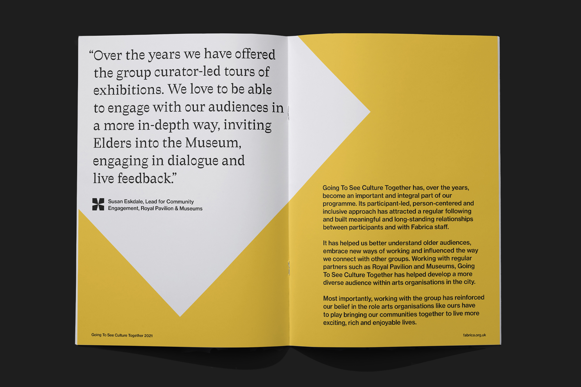
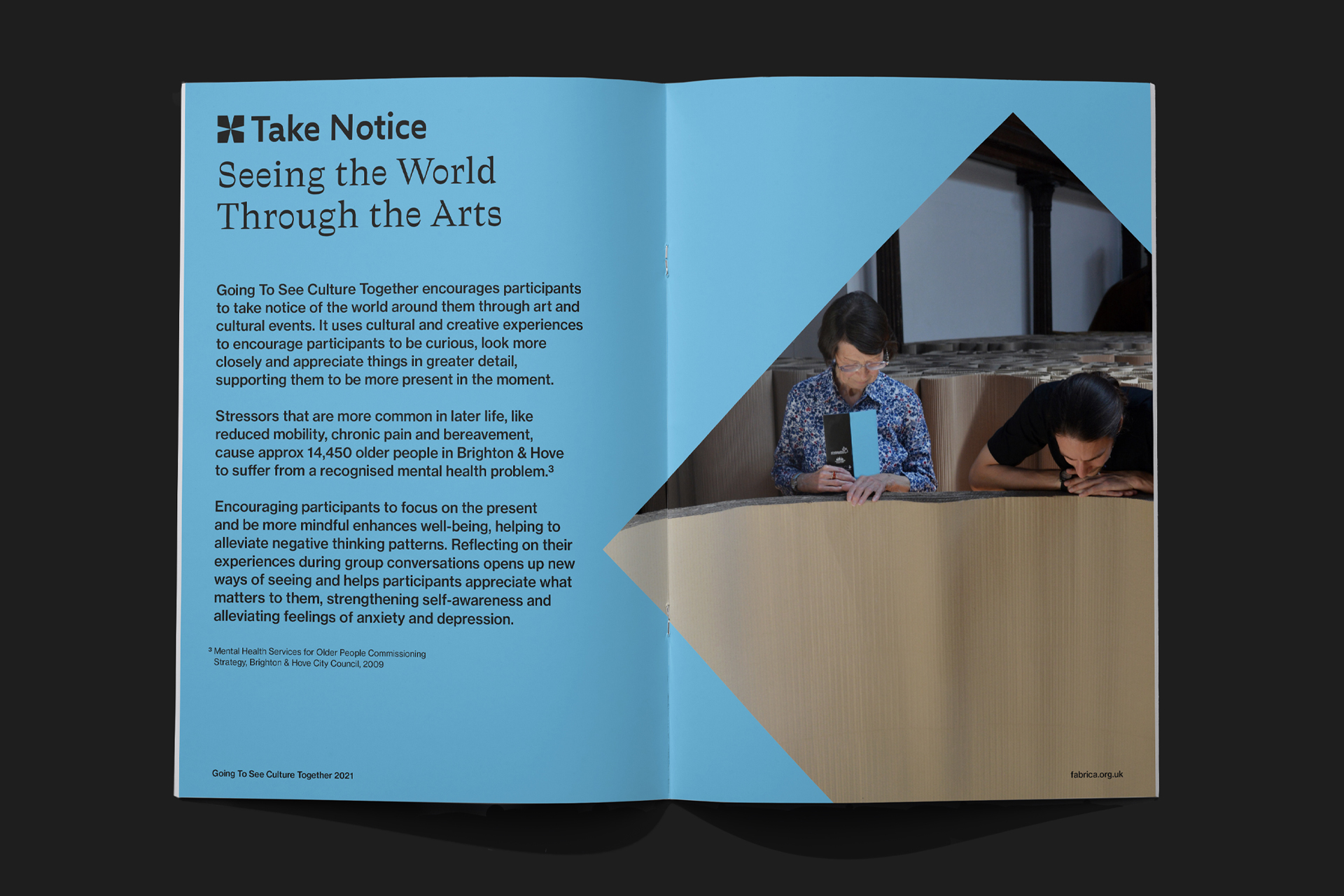
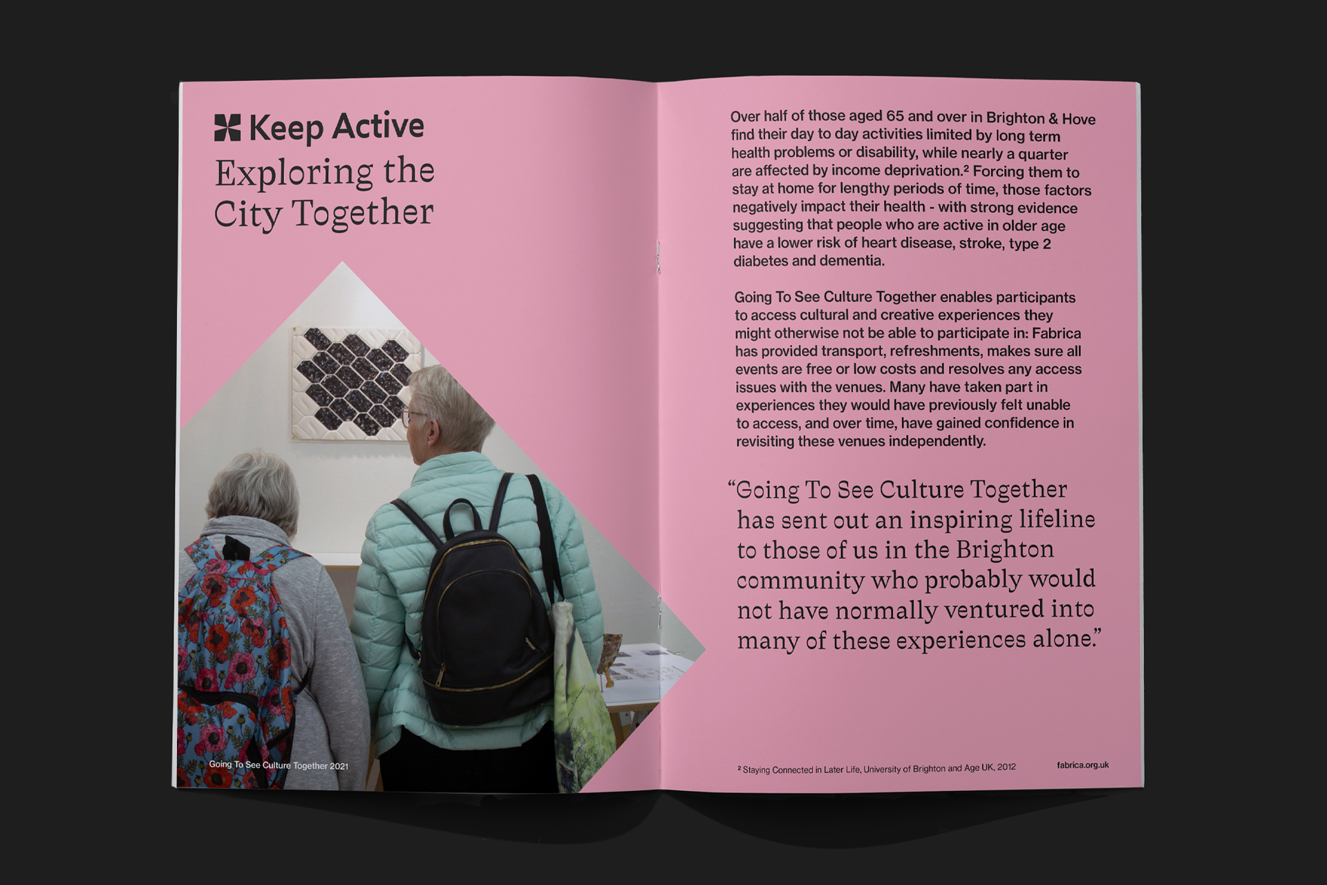
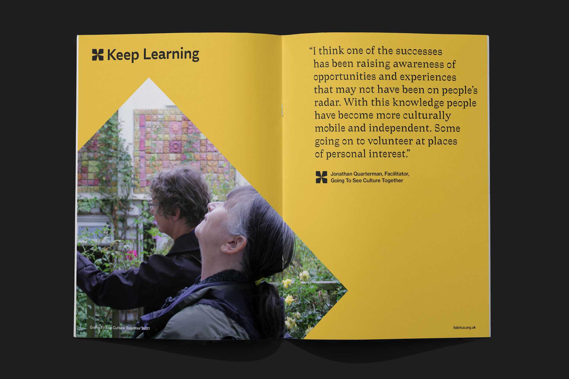
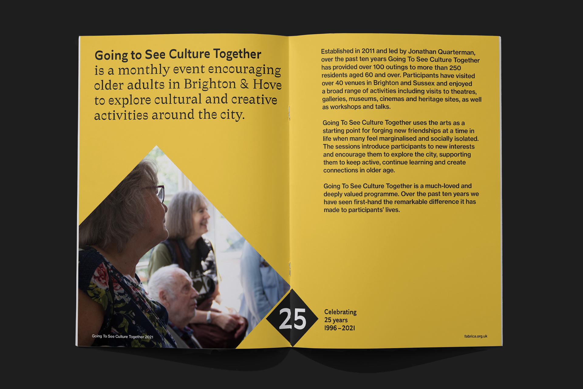
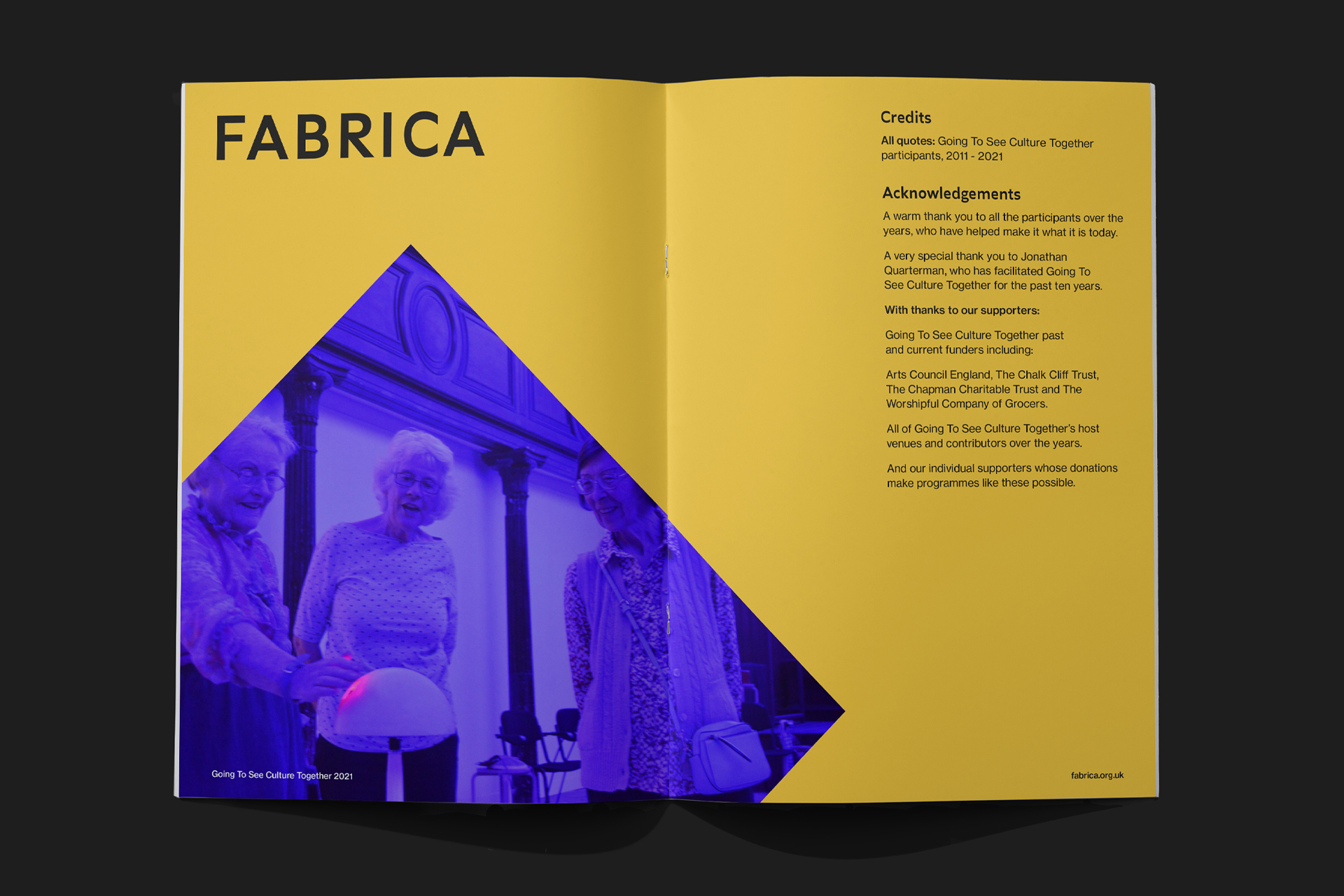
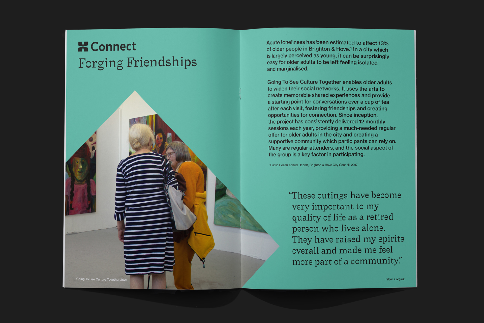
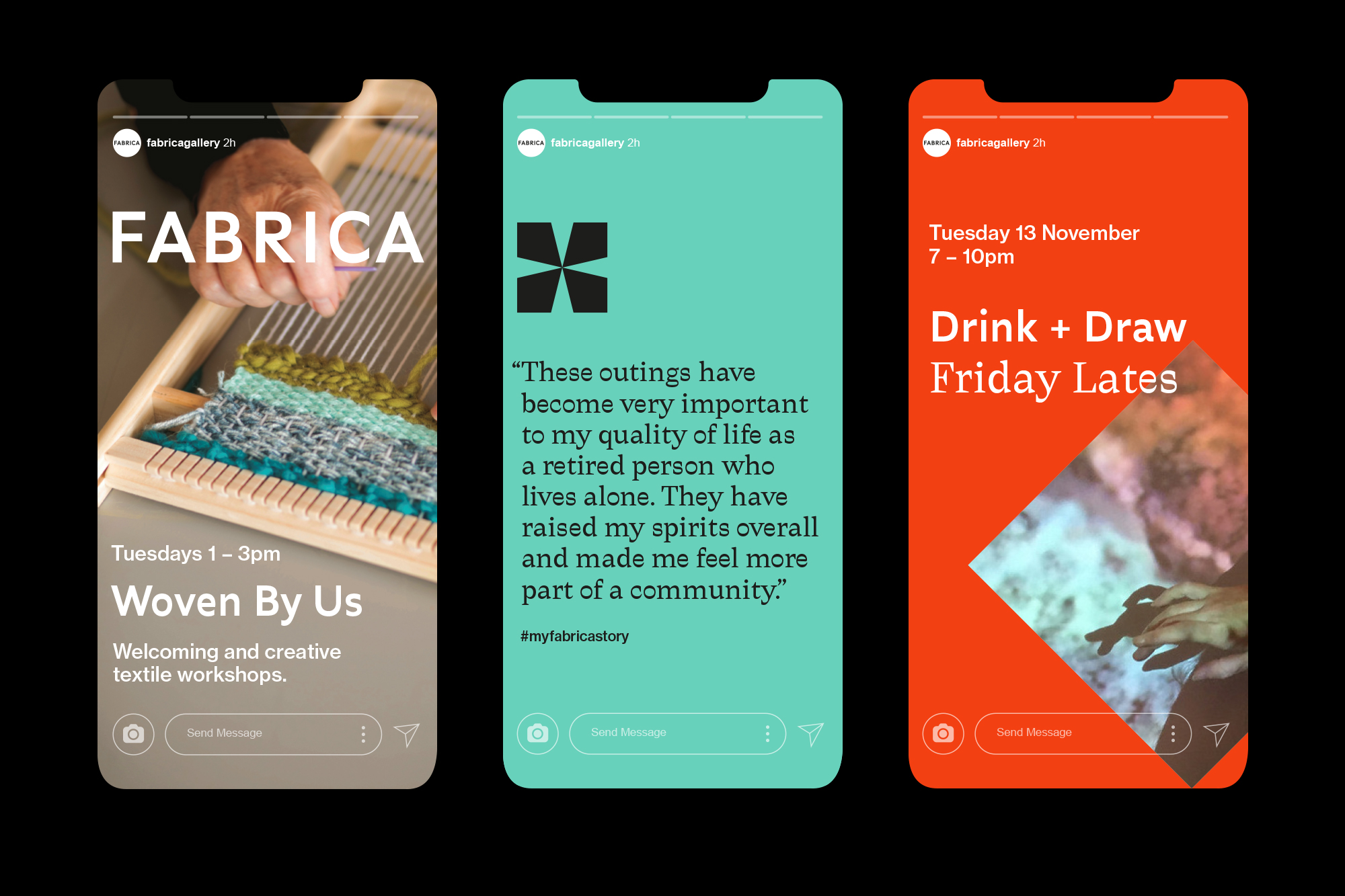
We started with Fabrica’s history, taking shapes from the building and even colours from the stained glass as the basis for the new brand. Even the new typeface is inspired by traditional woodcut lettering. But we made these elements contemporary and accessible, with bold lines and eye-catching contrasts. By striking a balance between heritage and modernity, the flexible new brand stays true to the space and its subject, while making both more welcoming and accessible to the community.
