Central Saint Martins
An identity for a world class art college
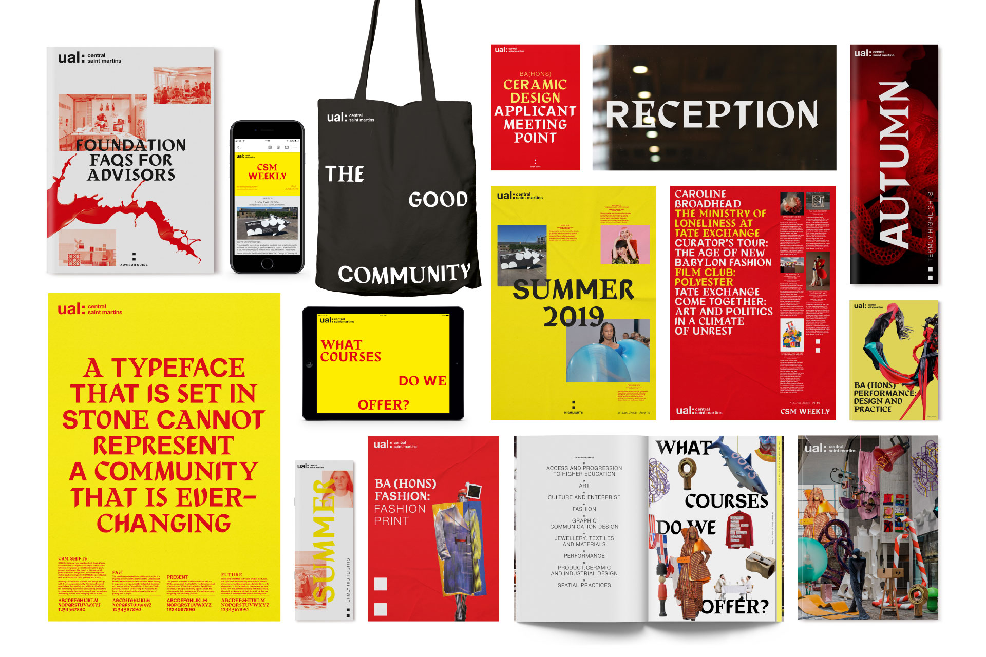
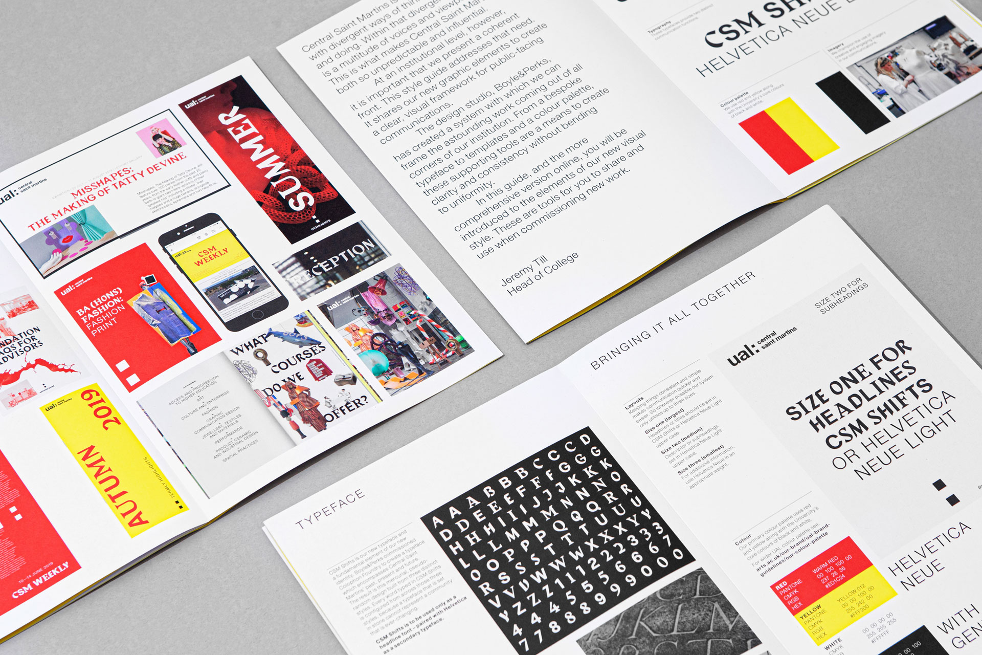
Since early 2018 we’ve been working with Central Saint Martins to create a new visual identity for the College. Designed to look like part of the UAL family, but distinct enough to reflect its own attitude and individuality as a world class art college. At it’s heart is a boisterous, anarchic and unpredictable typeface. The new typeface is paired with a restrained primary colour palette, and a visual system that brings cohesion but also the flexibility to represent the diverse creative community within the College walls.
We commissioned Colophon Foundry to create a dynamic multi-personality typeface inspired by found references and periods relevant to the history of the College: the past (the incredibly rich heritage and history), the present (the students there now) and the future (ambiguous and open to interpretation). Further reading here
PROJECT SCOPE
Audit and consultation
Visual identity
Custom typeface
Brand communications
“Boyle&Perks worked closely with us over a long period of time to research, conceive, develop and deliver a new and innovative visual language that has been widely used. It has been rightly celebrated as helping our art and design school marketing move ‘away from the herd’ of other HE institutions, reaffirming CSM’s originality and ever-changing attitude to art and design teaching and learning.”
Stephen Beddoe
Director of External Relations


